Since Living in Japan, I have been fascinated with Nippon Professional Baseball, the Japanese baseball league. As a designer, I wanted to take a shot at re-designing each of the teams in the league to further explore the visual history of the league and try to update each identity myself.
I chose to start with my new hometown team, the Tokyo Yakult Swallows!
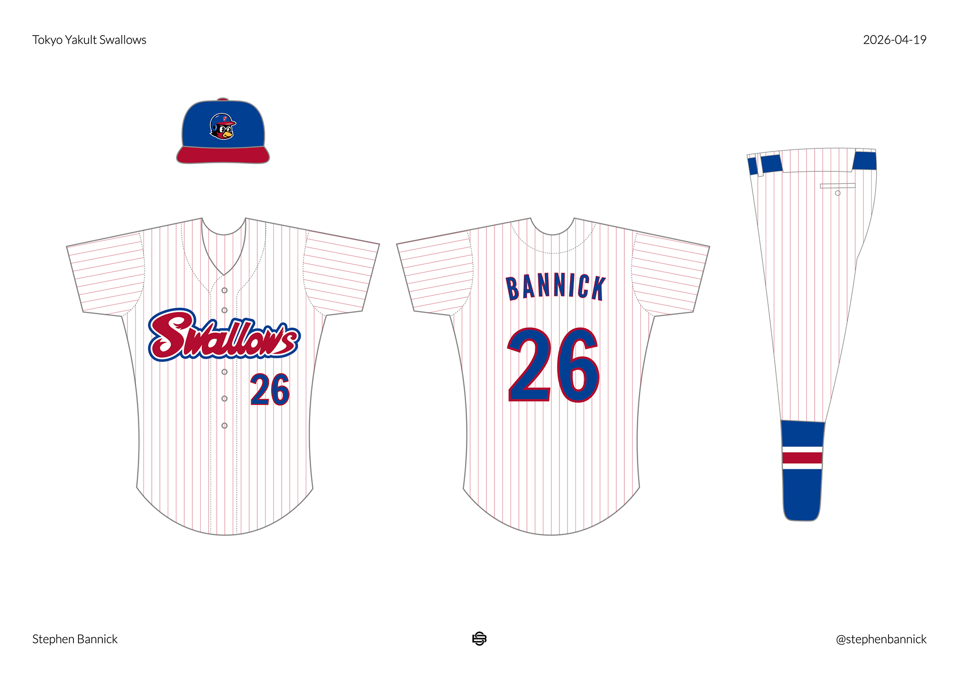
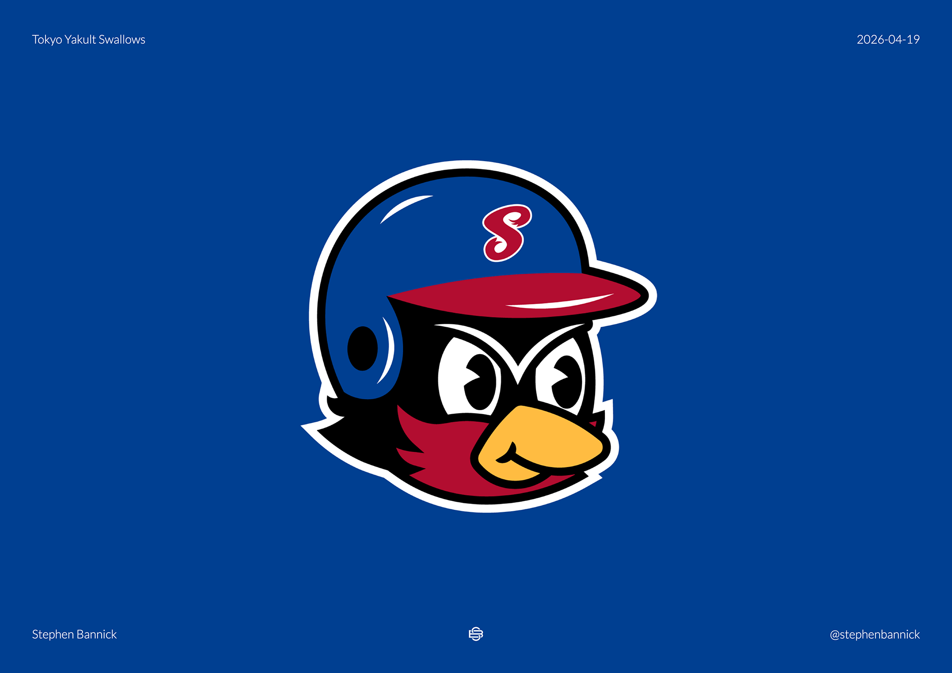
I love the current Swallows wordmark, so I wanted to design a full brand around the soft yet sharp style of this script. First, I started by retracing the wordmark, cleaning it up and updating it for my concept. Next, I carried the curves and points to a new Swallows mascot character. I also love the current Swallows mascot, so I wanted to keep the energy of the original mascot, but give him a fluffier makeover. For the helmet emblem, I took the S from the script and placed it on a blue cap with red bill. For the uniform, I wanted to keep the retro colors of royal blue and red, and carried these throughout three uniforms.
This design is just a fan concept for the Swallows, but I would be very excited to see them wear something like this on the field!